Categories
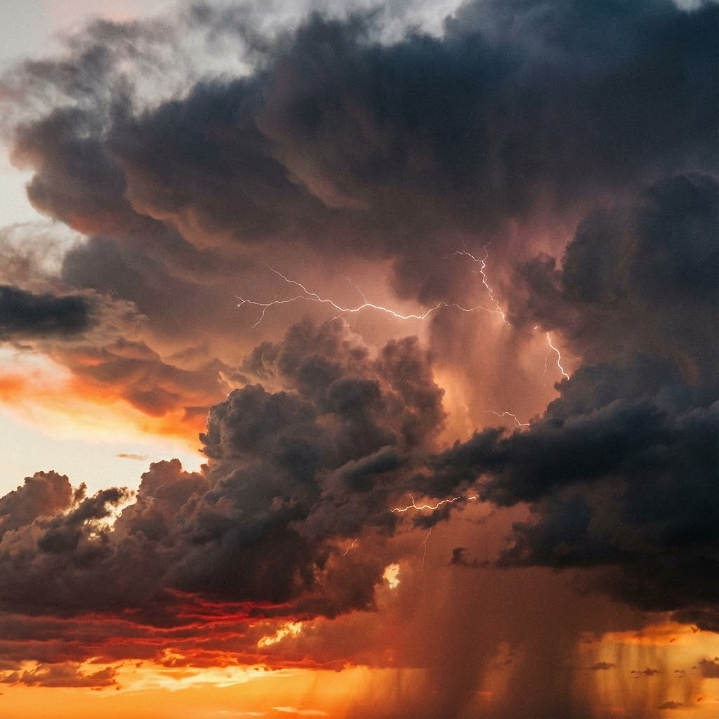
Thunder Sky
Thunder Sky showcases a dramatic storm scene with dark thunderclouds, striking lightning, and a fiery sunset glow breaking through the sky. This high-resolution weather image is perfect for backgrounds, cinematic designs, environmental concepts, editorial use, and creative projects that require a powerful, moody, and atmospheric visual impact.
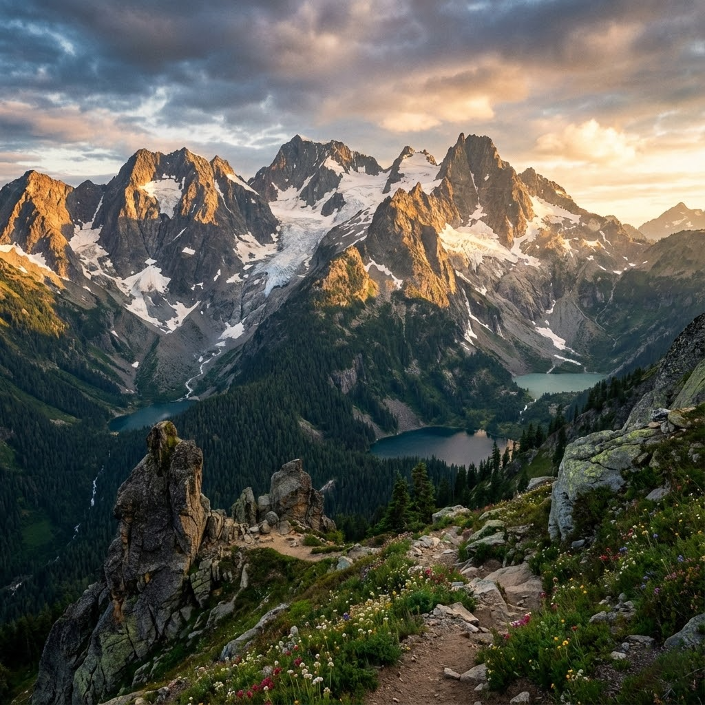

Perfect Landscape captures a breathtaking mountain scene with rugged peaks, lush green valleys, alpine lakes, and vibrant wildflowers under a dramatic sky. This high-resolution landscape image is ideal for websites, travel blogs, wallpapers, branding, backgrounds, and creative design projects that need a natural, scenic, and peaceful visual appeal.
Design doesn’t always require expensive software. Today, there are powerful free design tools that help designers create, collaborate, and stay productive—without compromising quality. Whether you’re a beginner or a professional, having the right tools can dramatically improve your workflow.
At Portrait Pixels, we support designers not only with high-quality design assets but also with knowledge that helps creatives work smarter. Here are some essential free tools every designer needs.
Canva is a user-friendly design tool ideal for creating social media posts, presentations, and marketing graphics. It offers drag-and-drop functionality, free templates, and basic editing tools—perfect for fast design tasks.
Best for: Social media graphics, posters, and simple layouts
Figma is a powerful cloud-based design tool widely used for UI/UX design. Its real-time collaboration feature makes it ideal for teams and freelancers working remotely.
Best for: Web design, app interfaces, wireframes, and prototypes
GIMP is a robust open-source image editing tool that offers advanced features similar to Adobe Photoshop. It supports layers, masks, filters, and custom brushes.
Best for: Photo editing, image manipulation, and raster design
Inkscape is a free vector graphics editor used for creating logos, icons, illustrations, and typography-based designs. It supports SVG files and professional export options.
Best for: Logos, icons, illustrations, and vector artwork
High-quality visuals are essential for strong design. Platforms like Unsplash and Pexels offer royalty-free stock images that can be used for personal and commercial projects.
💡 Tip: Combine these images with premium-style assets from Portrait Pixels to elevate your designs.
DaVinci Resolve offers advanced video editing, color correction, and audio tools in its free version—making it a top choice for motion designers and content creators.
Best for: Video editing, color grading, and motion projects
Coolors helps designers generate color palettes instantly. It’s perfect for branding projects and ensuring color harmony in designs.
Best for: Color inspiration and palette creation
Free tools become even more powerful when paired with ready-made design assets. Using PSD templates, PNG elements, stock images, and videos from Portrait Pixels can save time, maintain consistency, and enhance visual quality—without extra cost.
You don’t need expensive software to create great design. With the right free tools and quality design assets, any designer can produce professional-level work.
Explore creative resources at Portrait Pixels and make every design count.
Create smart. Design better.
Color is more than a visual element—it’s a powerful communication tool. In design, colors influence emotions, shape perceptions, and guide user behavior. Understanding color psychology in design helps designers create visuals that connect with audiences on a deeper level.
At Portrait Pixels, we believe that the right color choices can transform good design into impactful design. Let’s explore how color psychology works and how you can use it effectively.
Color psychology is the study of how colors affect human emotions and behavior. Different colors evoke different feelings, associations, and responses. In design, these psychological effects are used to communicate messages, reinforce brand identity, and improve user experience.
Using colors strategically can:
Strengthen brand recognition
Influence purchasing decisions
Improve readability and usability
Create emotional connections
Guide attention and hierarchy
Whether you’re designing a logo, website, advertisement, or social media post, color plays a vital role in how your design is perceived.
Red evokes passion, excitement, and urgency. It is often used in call-to-action buttons, promotions, and food-related branding. However, excessive use can feel overwhelming.
Blue represents reliability, calmness, and professionalism. It’s widely used in corporate branding, technology companies, and healthcare designs.
Yellow conveys happiness, warmth, and creativity. It works well for attention-grabbing elements but should be balanced to avoid visual fatigue.
Green symbolizes nature, health, and sustainability. It’s commonly used in eco-friendly, wellness, and finance-related designs.
Purple is associated with creativity, luxury, and sophistication. It’s often seen in beauty, fashion, and premium brands.
Black communicates elegance, authority, and minimalism. It’s popular in high-end branding and modern design layouts.
White space creates balance, clarity, and focus. It improves readability and gives designs a clean, professional look.
Different cultures and age groups may interpret colors differently. Always consider who you’re designing for.
Your color palette should reflect your brand’s values, tone, and message. Consistency builds trust.
Color contrast helps guide attention and improve usability. Important elements should stand out clearly.
Too many colors can confuse users. Limit your palette and use accent colors strategically.
High-quality design assets make it easier to apply color psychology effectively. At Portrait Pixels, our images, PSD templates, PNG elements, and stock videos are created with thoughtful color balance and modern aesthetics—helping designers achieve visually compelling results faster.
Color psychology is a powerful tool in design when used intentionally. By understanding how colors influence emotions and behavior, designers can create visuals that communicate clearly and leave lasting impressions.
Explore creative assets at Portrait Pixels and bring your designs to life with color that speaks.
Design with purpose. Let colors tell your story.
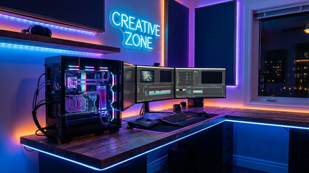
A well-optimized creative workspace can significantly improve productivity, creativity, and focus. Whether you’re a graphic designer, video editor, or content creator, your environment plays a crucial role in how efficiently you work. At Portrait Pixels, we believe that great design begins with a well-structured workspace.
Here are five effective ways to optimize your creative workspace and unlock your full creative potential.
A cluttered digital workspace can slow down your creative flow. Organize your files into clearly labeled folders such as Images, PSD Templates, PNG Assets, and Stock Videos. Use consistent naming conventions and keep frequently used assets easily accessible.
💡 Tip: Create a dedicated folder for assets downloaded from Portrait Pixels so you can quickly find high-quality resources when needed.
Your physical workspace directly affects your concentration. Choose a clean desk layout with only essential tools—your computer, drawing tablet, notebook, or camera gear. Keep cables organized and maintain good lighting to reduce eye strain.
A clutter-free desk leads to a clutter-free mind.
Optimizing your workspace isn’t just about space—it’s about efficiency. Using ready-made PSD templates and design elements can save hours of repetitive work. Templates allow you to focus on creativity rather than structure.
Platforms like Portrait Pixels provide editable assets that streamline workflows while maintaining professional quality.
Tailor your design software to suit your working style. Arrange panels, shortcuts, brushes, and presets in tools like Photoshop or After Effects to minimize unnecessary clicks. Dark mode interfaces and customized shortcuts can reduce fatigue and improve speed.
Small adjustments can make a big difference in long design sessions.
Surround yourself with inspiration. This could include mood boards, color palettes, typography samples, or even printed artwork. Inspiration boosts creativity and keeps ideas flowing during creative blocks.
Stock images and videos from Portrait Pixels can also be used to build digital mood boards that spark new concepts.
Optimizing your creative workspace is an ongoing process. By organizing assets, simplifying your environment, using smart tools, and staying inspired, you create a space where creativity thrives.
At Portrait Pixels, we support creators with high-quality images, PSD templates, PNG elements, and stock videos designed to make creative work easier and more enjoyable.
Design smarter. Create better. Let your workspace work for you.